Blog

  • Enhancing Workflow Efficiency

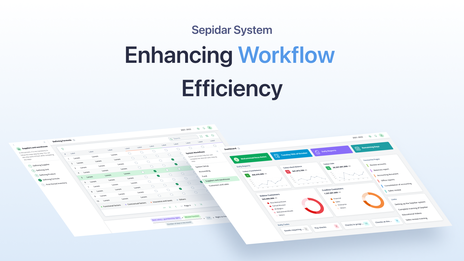
    Enhancing Workflow Efficiency

    Overview

    Project: Redesigning workflow navigation for Sepidar System
    Role: UX Designer
    Tools Used: Figma
    Methodology: Design Thinking
    Outcome: Improved task completion speed and increased user satisfaction

    Introduction

    Sepidar System is an enterprise platform designed for professional users. Despite Sepidar System’s comprehensive functionality, users often found it challenging to navigate due to the complexity of completing tasks in a specific sequence across various modules.

    The Problem

    Each module in Sepidar System required users to follow a set of predefined steps in a specific order. However, the system did not intuitively guide users through these workflows, leading to inefficiencies and confusion.

    The Solution

    To address this challenge, I designed the “System Workflows” sidebar menu, a feature that:

    1. Identifies and organizes the required steps for each module.
    2. Allows users to choose a workflow and view the steps involved.
    3. Provides direct navigation to each step, enabling users to complete their workflows efficiently.

    Design Process

    Research and Insights

    The design process began by analyzing data provided by product managers and studying workflows from the previous system. This research helped me understand the sequence and dependencies of steps within each module.

    Ideation and Prototyping

    Using Figma, I created:

    • Low-Fidelity Wireframes: To map out the structure of the “System Workflows” menu.
    • High-Fidelity Wireframes and Prototypes: To refine the design and ensure clarity and usability.

    Results and Impact

    Usability Test

    The redesigned workflow navigation brought significant improvements:

    • Faster Task Completion: Users could easily navigate through the system and complete their tasks more efficiently.
    • Higher User Satisfaction: Feedback indicated that the sidebar menu greatly improved usability and reduced frustration.

    Loading

  • Sepidar Navigation Menu

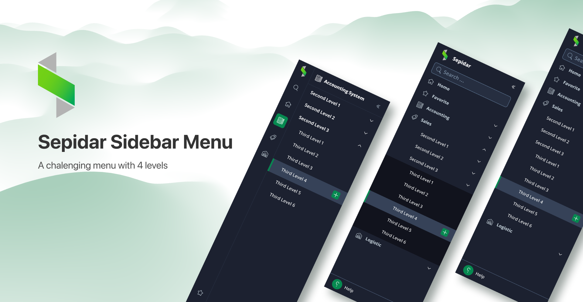
    Sepidar Navigation Menu

    Protected Area

    This content is password-protected. Please verify with a password to unlock the content.

  • Fanoos Design System

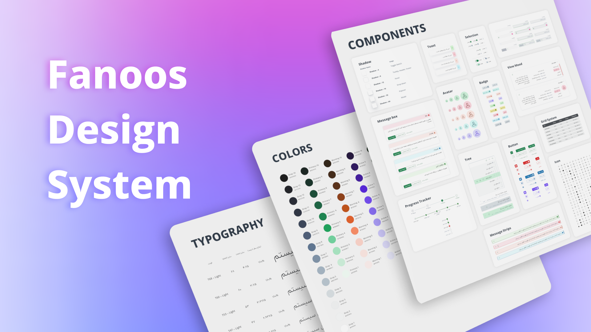
    Fanoos Design System

    Protected Area

    This content is password-protected. Please verify with a password to unlock the content.

  • Popcorn

    Popcorn

    Project Overview

    The popcorn application is a platform for reserving a seat in the cinema or theater. It enables users to choose a movie based on ratings and critiques and then select a cinema based on their location on the map or options offered by the application. Also, there is a rating part for the cinemas that people could rate regarding the services and facilities.
    The application allows users to filter movies based on genre, production year, etc. In addition, it offers some movies based on the user’s past experience. Another cool feature that has been added to this application is the snack bar that enables users to easily buy some snacks that make watching movies more enjoyable also there will be free popcorn for every ticket the users buy.

    Project duration

    February 2022 to September 2022

    The Problem

    It’s hard to stand in long lines to buy a ticket for your favorite movie.

    The Goal

    Make it easy for busy people to reserve a seat in the cinema or theater for their favorite movie.

    1- Understanding the user

    User research, Pain points, Personas, User flow

    User research

    I conducted some interviews and created empathy maps to understand the user’s needs. A primary user group identified through research was movie fans who didn’t have time to stay in lines to buy tickets. This user group confirmed my initial assumptions about the Popcorn application.

    Pain points
    Persona
    User Flow
    Competitive audit

    I investigated some competitors to figure out their advantages and disadvantages in terms of improving the Popcorn application user experience. I chose three apps: Cinema Ticket, Book My Show, and Movie Ticket Booking. All three have good UI but they have some special advantages that I try to use for more convenience.

    Cinema Ticket

    • Has lots of details about the movie and cinema that make the choice easier
    • Critiques part for the movie.
    • Movie trailer

    Book My Show

    • Ability to add your favorite movies and get a notification for any available tickets

    Movie Ticket Booking

    • Provide a feature for getting the age of the user and offering a movie in terms of the user’s age

    2- Starting the design

    Digital low-fi wireframes, Competitive audit, Low-fidelity prototypes, Usability studies

    Digital Low-Fi Wireframe
    UI Kit

    After creating the lo-fi wireframes I made a small UI kit to make the application consistent then start designing the hi-fi wireframes.

    Digital hi-fi wireframes – First Try

    At first, I try to make some lo-fi wireframes based on my assumptions about the app. After doing some research and conducting some usability studies I made some changes and I add these parts to the wireframes.

    • Choosing a cinema based on the user’s location.
    • Adding details of the movie
    • The movie trailer
    • Being a facility for zooming in, on the seat-choosing page
    • Confirming the information

    3- Refining the design

    Mockups, High-fidelity prototypes, Accessibility

    Digital hi-fi wireframes – First Try

    In this phase, I conducted another usability test and found some new user needs. In Addition, I did a competitive audit with some competitors to find special features to add to the application.

    • Adding movie and cinema filters
    • Adding a page as a cinema profile for checking cinema services and facilities
    • Adding movie and cinema rating part
    • Ordering snacks for the movie
    • Offering 1 Free popcorn for every ticket

    4 – Going Forward

    Takeaways, Next Steps

    Loading

  • Pilot

    Pilot

    Project Overview

    The goal of this project is to create a trip planner that allows users to seamlessly plan their next trip and serves as a comprehensive tool for creating a complete travel itinerary.
    The primary features of the trip planner include the ability to search for and book transportation options, such as flights or trains, as well as the ability to reserve hotels or other forms of accommodation. Additionally, users can browse through a selection of entertainment options for their destination, including popular attractions, museums, and restaurants.
    One of the key features of the trip planner is the ability to choose your own transportation method for leaving and returning. This allows travelers to customize their trips to their individual needs and preferences.
    Another important aspect of the trip planner is the checklist feature, which enables users to create custom checklists for each trip. These checklists can be customized with specific items such as clothing, toiletries, and travel documents. Users can easily edit their checklists and mark items as complete as they prepare for their trip.

    Our Role

    Project duration

    May 1st to May 15th

    Problem & Goal Statement

    Design Process

    Persona

    User Flow

    User flow reflects the user’s progress from the launch of the application to exploring different choices and making a proper trip plan.

    Information Architecture

    UI Kit

    Low-Fidelity Wireframes

    High Fidelity Design

    Here is some high-fidelity design that comes from low-fidelity wireframes.

    Loading

  • Guardrails for a Payroll System

    Guardrails for a Payroll System

    Overview

    This case study is about my UX work on a Human Capital system, focused mainly on payroll-related features: compensation factors, formula configuration, manual value entry, payroll calculation, and issuing accounting documents.

    The product is built for expert, enterprise-level users. It’s powerful and highly configurable—which is great—but that flexibility also makes it fragile. When people are working with large volumes of sensitive financial data, even a tiny mistake can turn into a serious problem.

    So instead of zooming in on one screen or a single feature, this case looks at how I designed UX guardrails across multiple parts of the system. The goal was simple: reduce financial risk without limiting expert users or turning the product into a rule-heavy monster.

    The Problem

    Users could:

    • Configure complex payroll formulas
    • Adjust coefficients and calculation parameters
    • Manually enter large volumes of payroll data
    • Run payroll calculations
    • Issue accounting documents

    All of these actions were tightly connected. I remember thinking how scary it was that a single wrong number—maybe entered late in the day, maybe copied one row too far—could ripple through the system and affect payroll results or accounting outputs.

    At the time:

    • Most feedback appeared after actions were completed (for example, after issuing documents)
    • Payroll calculations already had anomaly detection, but from a UX perspective, the feedback wasn’t easy to act on
    • High-volume manual data entry made fatigue-related and repetitive errors very likely

    The core challenge was:
    How do you support expert users in a highly configurable, data-heavy financial system—while actively reducing costly mistakes—without adding friction or unnecessary development complexity?

    My Role

    • UX Designer working closely with the Product Owner and the development team
    • Responsible for interaction design and UX decisions
    • Focused on reducing risk through design—not defining payroll rules or business logic

    All business rules and calculation logic were owned by the PO. My job was to translate those rules into clear, safe, and efficient user experiences. That translation layer was where most of the real UX challenges lived.

    Constraints

    • Enterprise product with expert users
    • High-impact financial data
    • Large-scale manual data entry
    • Limited development capacity

    Every solution had to be realistic, lightweight, and scalable. Big ideas were great, but if they couldn’t survive real-world constraints, they weren’t useful.

    Key UX Decisions

    On pages related to payroll formulas and compensation factors, the biggest risk wasn’t misuse—it was accidental or unclear changes.

    To reduce that risk, the team and I focused on:

    • Clear separation between formula structure and editable values
    • Controlled input patterns to prevent accidental edits
    • Meaningful naming and grouping to lower cognitive load

    The intention was never to block users. These safety nets were about helping people stay oriented and confident about what exactly they were changing, especially in complex configurations.

    2. Guardrails for High-Volume Data Entry

    On the input values page, users enter monthly payroll data for many employees. It’s repetitive work, and honestly, that’s where mistakes love to hide.

    The main risks here were data loss, slow workflows, and subtle copy-paste errors.

    • Users work with one employee at a time
    • Data is automatically saved after each employee is completed
    • A clear “Save & Next” action creates a natural checkpoint

    This approach helped users focus and made sure work wasn’t lost halfway through a long session. One thing that really mattered here was giving users peace of mind while moving fast.

    • Users can move vertically between employees for the same payroll factor
    • Navigation is supported via keyboard shortcuts
    • The interaction mirrors familiar spreadsheet behavior

    The cool part was how quickly users adapted to this. It matched their mental model just like Excel, improved speed, and noticeably reduced repetitive mistakes.

    • For fixed factors, previous values are shown as reference
    • This makes unexpected changes easier to spot
    • Supports consistency and accuracy over time

    As a potential next step, we explored adding lightweight anomaly signals during data entry.

    The idea wasn’t to block users or enforce validation rules, but to gently say: “Hey, this value looks unusual.” These smart safeguards were meant to raise awareness early, so fewer issues would reach the payroll calculation stage.

    3. Designing Around Anomaly Detection

    Payroll calculation already included anomaly detection. From a UX point of view, detection wasn’t the real problem—actionability was.

    So the focus shifted to helping users understand what went wrong and fix it quickly.

    The design aimed to:

    • Take users directly to the source of the issue
    • Minimize the effort needed to investigate anomalies
    • Support both correction and intentional overrides

    Key interaction decisions included:

    • Automatically navigating users to the exact page where the anomaly originated
    • Highlighting the specific row or input field involved
    • Allowing users to either correct the value or explicitly ignore the anomaly when the outcome was intentional

    This turned anomaly detection from a passive warning into an active, usable part of the workflow.

    It’s also worth calling out that calculation-level anomaly detection works independently from the early anomaly signals explored during data entry. They operate at different moments in the journey and are designed to support each other—not conflict.

    Why This Matters

    Payroll systems are high-risk by nature.

    In environments like this, UX isn’t just about usability or speed. It directly affects trust, accuracy, and financial safety.

    This case shows how thoughtful protective patterns can:

    • Increase confidence in complex financial workflows
    • Reduce errors without restricting expert users
    • Protect critical data through interaction design

    Outcome

    • Safer configuration and data-entry experiences
    • Lower risk of incorrect or lost data
    • Faster, more focused workflows for expert users
    • A solid foundation for future UX guardrails

    Key Takeaway

    In high-risk enterprise systems, guardrails don’t always look like warnings or hard restrictions.Most of the time, they’re quiet, well-considered interaction decisions that guide users toward safer outcomes—without taking away the flexibility and control they depend on.

    Loading

  • Marketing Website

    Marketing Website

    The marketing website is designed to provide information about our products, market analysis, and competitor insights. It serves as a platform for users to gather information about the market, assess the competitive landscape, and understand the positioning of our software in the industry.

    Loading

  • Sepidar Landing Page

    Sepidar Landing Page

    This landing page serves as an introduction to the products offered by Sepidar System. It showcases a range of products, with a particular emphasis on the Sepidar and Dasht software solutions. These products are highlighted as the key offerings of the company, and the landing page provides an overview of their features, benefits, and unique selling points.

    Loading

  • Developers Website

    Developers Website

    A developer website is a platform designed to share articles and introduce the products developed by System Group. It serves as a central hub for developers to access valuable content, including informative articles, tutorials, and resources related to System Group’s products. The website aims to provide developers with in-depth knowledge and insights into the products, helping them understand the functionalities, integration capabilities, and best practices for using the software solutions offered by System Group. It may also offer opportunities for developers to engage in discussions, seek support, and stay updated on the latest product releases and updates. The developer website acts as a valuable resource for developers to enhance their skills, explore innovative approaches, and maximize their productivity when working with System Group’s products.

    Loading

  • Rahkaran Retail System – Mobile

    Rahkaran Retail System – Mobile

    Protected Area

    This content is password-protected. Please verify with a password to unlock the content.